At a trade show last spring, a buyer walked the aisle and stopped cold at one booth. Same product category as the booth next door. Same price point. The only real difference was on the outside of the box.
At the first booth, the logo sat front and center, sized so it registered from across the aisle. The buyer knew the brand before they picked anything up. At the second booth, the logo was tucked into a bottom corner in a color that blended into the background — buyers had to lift the box and turn it over just to figure out who made it. Most didn’t bother.
That’s not bad luck. That’s design. Packaging influences purchase decisions within 7 seconds of first visual contact, and logo placement is one of the biggest factors in whether your brand registers in those 7 seconds or gets skipped entirely.
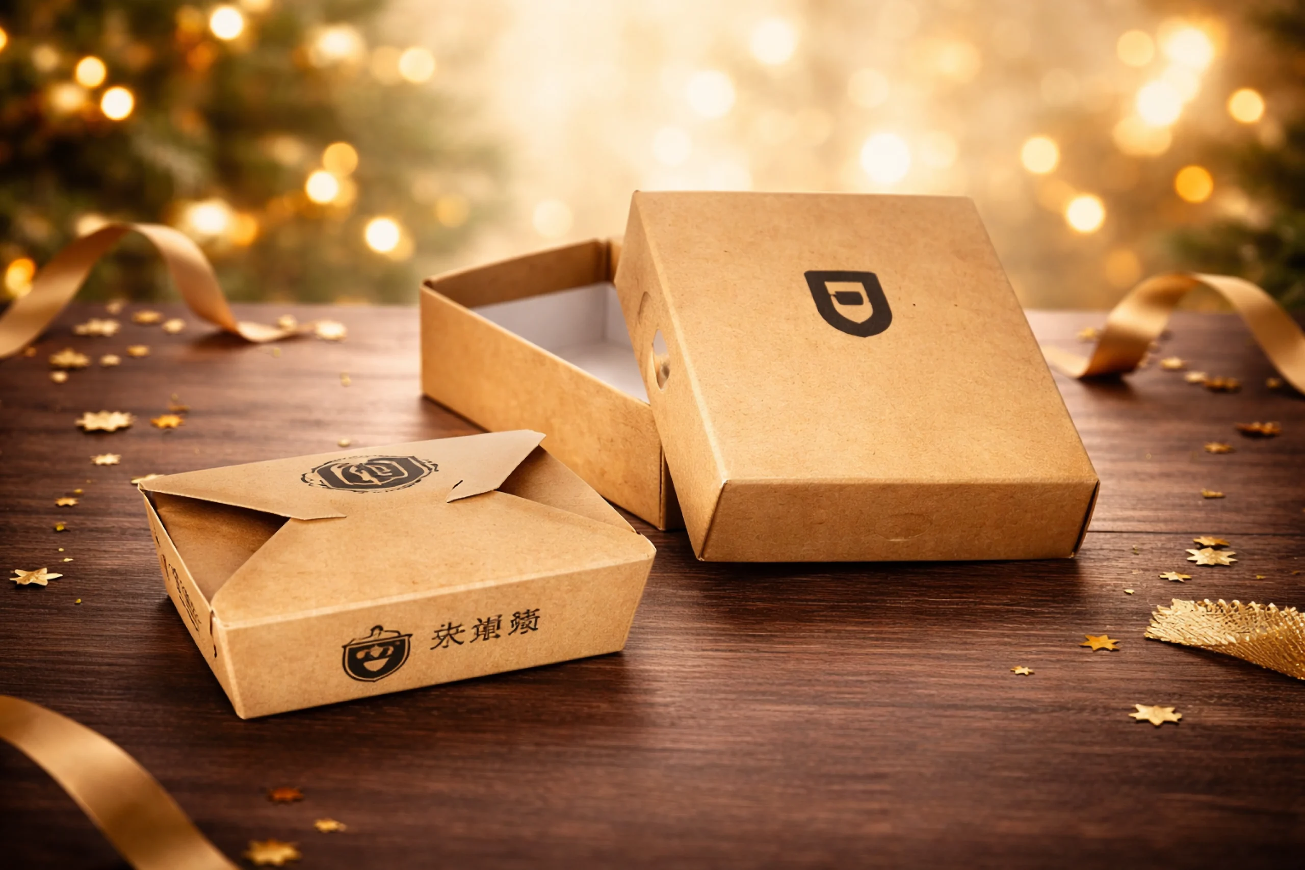
If you’re designing custom packaging boxes with logo for your products, this guide covers what actually moves the needle: placement, print method, materials, and the mistakes that quietly cost brands sales. You’ll find specific numbers, real examples, and answers to the questions buyers and brand owners search for most.
What Makes Logo Packaging Work — And What Doesn’t
Start with the 3-foot rule. Your logo needs to be readable from about 3 feet away on a retail shelf, and at roughly arm’s length in a product photo online. If someone has to lean in to figure out whose product they’re looking at, the logo has already failed its main job.
Size matters more than most brand owners expect, and it cuts both ways. A logo that’s too large can look like the brand is overcompensating — it reads as desperate rather than confident. A logo that’s too small gets lost in the noise of ingredient lists, certifications, and other panel text. There’s a working sweet spot, and it’s closer to “slightly bigger than feels comfortable” than most first drafts land.
Placement hierarchy matters too. The front panel is where your logo does its heaviest lifting — every other panel is secondary. Within most product categories, a centered logo builds recognition faster than a corner placement, simply because it sits where the eye naturally lands first. Corner placement isn’t wrong, but it works best in a specific case: minimalist luxury brands where the logo is intentionally the only graphic element on the box, and the empty space around it is doing the branding.
Color contrast is the detail that quietly wrecks otherwise good designs. A logo that looks fine on your monitor can vanish against a similarly-toned background once it’s printed and photographed under warehouse or store lighting. If the contrast isn’t strong, the logo isn’t really there — it’s just technically present.
Case Study: Chicago Candle Brand. A Chicago-based candle brand had its logo in the bottom right corner of the box for years. They redesigned it to sit centered on the front panel with gold foil stamping. Within 90 days, boutique retailers who stocked the brand started identifying it on sight instead of reading the label first — staff reported they could recommend the product faster because they recognized the box before they recognized the name.
Packaging Logo Printing Methods — What Each Delivers
Different print methods deliver different results, and the right choice depends on order volume, budget, and how premium the product is meant to feel.
Digital Printing Best for: small batch orders, detailed color designs, startup brands. What it delivers: full color accuracy, fast turnaround, low minimum order quantities. When to choose it: your first production run, seasonal packaging updates, or test orders before committing to a bigger batch.
Offset Printing Best for: large volume production where color has to stay consistent across thousands of units. What it delivers: precise color matching and cost efficiency at scale. When to choose it: established brands placing consistent orders of 500+ units.
Foil Stamping Best for: logo treatment on premium and gift packaging. What it delivers: a metallic reflection that flat printing simply can’t reproduce. When to choose it: gift products, luxury positioning, or items priced over roughly $40.
Embossing Best for: tactile brand recognition. What it delivers: a raised logo customers can feel when they pick up the box. When to choose it: when touch is part of the brand experience, not just sight.
Spot UV Best for: logo highlighting on matte surfaces. What it delivers: a gloss-on-matte contrast that reads as understated and sophisticated rather than flashy. When to choose it: premium products where subtlety matters more than shine.
Color consistency across all of this is worth taking seriously — color alone can increase brand recognition by up to 80%, which makes matching your logo color precisely across every packaging format one of the highest-return branding investments you can make.
How to Design Branded Product Boxes That Actually Sell
Clean designs consistently outperform busy ones on a retail shelf, where a shopper’s eye has a fraction of a second to process what they’re looking at. Simplicity isn’t a stylistic preference here — it’s a functional requirement.
That simplicity depends on getting the information hierarchy right:
- Product category — largest and most prominent element
- Brand name and logo — second
- Key benefit or variant — third
- Supporting information (ingredients, certifications, fine print) — smallest
Most brands get this backwards. They lead with the brand name because it feels like the most important thing to them, and bury what the product actually is in smaller text. But a shopper who doesn’t already know your brand needs to understand what’s in the box before they care who made it. Category first, brand second is what actually converts browsers into buyers.
Color choice should come from a shelf audit, not a mood board. Before finalizing a palette, look at what your direct competitors are already using in the same retail environment. If everyone in your category leans toward a particular color family, standing apart from it — not blending into it — is what gets a shopper’s eye to stop.
Typography has real limits on packaging: cap it at three fonts maximum, keep everything readable from 3 feet, and check contrast ratio the same way you’d check it for the logo itself. Text that looks fine in a design file can go flat and illegible once it’s printed on kraft or corrugated stock.
Before committing to a full production run, run the packaging sample test: photograph a physical sample under the lighting conditions it’ll actually be seen in — store shelf, warehouse, or your own product photography setup. Screens lie about how print colors and contrast will actually look.
Materials for Custom Packaging Boxes With Logo
Material choice isn’t just about cost and durability — it directly changes how your logo prints and reads.
White Cardstock Logo printing advantage: full color accuracy and vibrant results. Best logo styles: complex multi-color designs, photographic elements, bright brand colors.
Kraft Paperboard Logo printing consideration: colors shift warmer and more muted on kraft than on white stock. Best logo styles: minimal black, dark green, gold foil, or embossing. Not ideal for: bright blues, vivid pinks, or neon tones, which lose vibrancy on the brown base.
Corrugated Board Logo printing consideration: the slightly textured surface affects how fine detail reproduces. Best logo styles: bold, simple logos in one or two colors.
Rigid Chipboard Logo printing advantage: a specialty paper wrap over the chipboard creates a premium, smoother print surface. Best logo styles: foil stamping, embossing, or soft-touch finishes combined with spot UV.
Case Study: Portland Skincare Brand. A Portland-based organic skincare brand switched from white cardstock to FSC-certified kraft boxes with a gold foil logo stamp. The material change reinforced their natural-ingredient positioning visually, not just in the copy on the label. Within two months of the rebrand, retailers in Whole Foods-adjacent boutiques began stocking the brand.
Direct Questions Buyers Search
How much does custom packaging with logo cost? Cost depends primarily on quantity, print method, and material — digital printing on small runs costs more per unit but requires less upfront investment, while offset printing brings the per-unit cost down significantly at higher volumes. A basic kraft box with a one-color logo will always cost less than a rigid chipboard box with foil stamping and spot UV. Getting an accurate number means specifying quantity, size, material, and finish together, since each variable shifts the price independently.
What is the minimum order for custom logo boxes? Minimum orders start from 25 boxes at UCustomPackaging, which makes small test runs realistic for new brands. Lower minimums let you validate a design in the real world — on a shelf, in photography, in a customer’s hands — before committing to a larger production run. This matters most for brands still refining logo placement or color.
How long does custom logo packaging take to produce? Production typically takes 7 business days, with shipping time added on top depending on destination and method. Rush production is often available for time-sensitive launches, but it usually comes at a premium. Building in a buffer beyond the production window is worth doing for any hard launch date.
What file format do I need for logo packaging? A vector file — AI, EPS, or PDF — is what printers need for logo packaging. Vector files scale to any size without losing sharpness or introducing pixelation, which matters because your logo will likely be resized across different box formats. A raster file like a JPEG or PNG can work in a pinch, but it risks blurry or jagged edges once printed at scale.
Can I get samples before ordering custom logo boxes? Yes, physical samples are typically available before committing to a full production run. Samples let you check color accuracy, material feel, and print quality under real lighting rather than trusting a screen. This step catches the gap between how a design looks in a file and how it actually looks printed.
Common Logo Packaging Mistakes That Cost Brands Money
Mistake 1: Logo too small for the packaging size. How it fails: it becomes invisible on the shelf and gets lost in product photography. Fix: keep the logo at a minimum of roughly 15% of the front panel.
Mistake 2: Low contrast logo color. How it fails: the logo disappears against a similarly toned background. Fix: always test the actual contrast ratio before finalizing, not just how it looks on screen.
Mistake 3: Ordering without physical samples. How it fails: screen colors never match print exactly, and the difference only shows up after the full run is done. Fix: always request a physical sample before committing to full production.
Mistake 4: Same logo size across different packaging formats. How it fails: a logo sized for a large mailer box shrinks into near-invisibility on a small folding carton. Fix: resize the logo proportionally for each individual format rather than reusing one fixed size.
Mistake 5: Ignoring the packaging photography test. How it fails: a logo that looks great in person can wash out completely under product photography lighting. Fix: photograph the packaging under real conditions before finalizing the design for launch.
Quick Reference – Custom Packaging Boxes With Logo
Custom packaging boxes with logo are boxes designed and printed so that a brand’s logo functions as the primary visual identifier on the shelf or in a product photo, rather than as a decorative afterthought. They matter because most purchase decisions are made in seconds, and a logo that registers quickly builds recognition that compounds across repeat purchases, word of mouth, and retail placement.
The three most important design decisions are logo placement, color contrast, and print method. Placement determines whether the logo sits where a shopper’s eye naturally lands, typically the centered front panel for most categories, with corner placement reserved for minimalist luxury positioning. Color contrast determines whether the logo is actually visible once printed and photographed under real lighting rather than screen lighting. Print method — digital, offset, foil stamping, embossing, or spot UV — determines both the visual finish and how the printing budget scales with order volume.
Material choice affects how a logo ultimately prints. White cardstock supports full-color, detailed logos best, kraft paperboard shifts colors warmer and favors minimal or foil-stamped designs, corrugated board favors bold single-color logos due to its texture, and rigid chipboard with a paper wrap supports premium finishes like foil and embossing.
On the production side, minimum orders typically start around 25 boxes, production generally takes about 7 business days before shipping, vector files (AI, EPS, or PDF) are required for accurate logo printing, and physical samples are usually available to check color and material before a full production run.
Conclusion
Logo packaging success comes down to three decisions made before design work even starts: correct placement, the right material for your product’s positioning, and a print method that matches your order volume and budget. Get those three right, and the rest of the design process becomes far easier.
If you’re starting from scratch, begin with a shelf audit of your direct competitors, then request physical samples in your top two material choices before committing to a full run. Explore our custom packaging boxes with logo printing options in digital, offset, foil stamping, and embossing for brands across the United States.
FAQ
1. What are custom packaging boxes with logo? They’re packaging boxes designed and printed so the brand’s logo is a primary, deliberately placed visual element rather than an afterthought. The goal is for the logo to communicate brand identity within seconds of visual contact, whether on a store shelf or in a product photo. Design choices like placement, size, and contrast are made specifically to support that recognition. Good logo packaging works as a marketing tool, not just a container.
2. How does logo placement affect brand recognition? Placement determines how quickly a shopper’s eye finds and processes the logo. A centered front-panel logo tends to build recognition faster than a corner placement for most product categories, since it sits where attention naturally lands first. Corner placement can still work well, particularly for minimalist luxury brands where the logo is the only graphic element. The wrong placement forces customers to search for the logo instead of registering it instantly.
3. What printing method is best for packaging logos? There isn’t a single best method — it depends on order volume and product positioning. Digital printing suits small batches and startup brands needing fast turnaround, while offset printing suits large, consistent volume orders. Foil stamping and embossing work best for premium or gift products where texture and shine reinforce the price point. Matching the method to both budget and brand positioning gets the best result.
4. How long does production take? Production typically takes around 7 business days, not counting shipping time to the destination. Rush options are often available for tighter timelines, though they usually come at an added cost. It’s worth building in extra buffer time beyond the stated production window for any hard launch date.
5. What is the minimum order quantity? Minimum orders can start from as low as 25 boxes, which makes small test runs accessible for newer brands. This allows a design to be validated in real-world conditions — on shelf, in hand, in photography — before a larger production commitment. Larger volume orders typically bring the per-unit cost down significantly.
6. Can I order samples first? Yes, physical samples are generally available before committing to a full production run. Samples let you verify color accuracy, material texture, and overall print quality under real lighting conditions rather than relying on a screen. This step often catches issues that wouldn’t be visible until the full order was already printed.
7. What file format is needed? Vector files — AI, EPS, or PDF — are the standard requirement for logo packaging printing. Vector formats scale cleanly to any size without losing sharpness, which matters since the same logo often needs to work across multiple box sizes. Raster formats like JPEG can sometimes be used but risk blurry or pixelated edges once printed and scaled up.
8. What materials are available? Common options include white cardstock, kraft paperboard, corrugated board, and rigid chipboard, each with different implications for how a logo prints. White cardstock supports full-color, detailed designs, while kraft paperboard suits minimal or foil-stamped logos due to its warmer base tone. Corrugated board favors bold, simple logo designs because of its texture, and rigid chipboard supports premium finishes like foil stamping and embossing.
9. Can small businesses afford custom logo packaging? Yes — low minimum order quantities and digital printing options make custom logo packaging accessible even for very small first runs. Costs scale with quantity, material, and finish, so a simple one-color kraft box will cost far less than a foil-stamped rigid box. Starting with a smaller, simpler run and upgrading materials or finishes as the brand grows is a common and practical approach.
10. What is the best logo size for packaging? A common guideline is keeping the logo at a minimum of about 15% of the front panel so it remains visible from roughly 3 feet away on a shelf. The right size also depends on the box format — a size that works on a large mailer box may be too small on a compact folding carton. Testing the logo at actual print size, not just on screen, is the most reliable way to confirm it reads correctly.